图表题
语料库
“图表”
graph / chart / diagram / table / flow chart / picture / pictorial / illustration / presentation / map / pie chart / bar graph / bar graph / column graph / process diagram
动词
show / represent / illustrate / present / give / provide / outline / describe / express / indicate / figure (n. for sth.) / demonstrate
depict / enumerate(列出) / delineate(详细描述)/ denote / summarise
give data on / give information on / present information about / show data about / sketch out
compare / show contrast
描述
the comparison of ... / the differences ... / the changes ... / the number of ... / information on ... / data on ... / the proportion of ... / the amount of / the quantity of / information on ... / data about... / comparative data... / the trend of... / the percentages of... / the ratio of...
趋势类词汇
上升
- an upward/ceiling trend/tendency (in)
- 幅度小
- climb
- edge up
- go up
- a steady climb
- 幅度一般
- increase to / an increase (in)
- rise to / a rise (in)
- grow to / a growth (in)
- uplift
- upsurge
- 幅度急剧
- shoot up (shot up)
- surge to (surged)
- soar to (soared)
- rocket
- burgeon
- a leap / jump
下降
- a downward trend
- 幅度小
- fall (fell) / a fall (in)
- subside
- dip slightly
- a gental decrease
- a reduction
- 幅度一般
- decrease to / a decrease (in)
- decline to (declined) / a decline (in)
- drop to (dropped) / a drop (in)
- deteriorate
- 幅度急剧
- plummet to (plummeted)
- plunge to (plunged)
- collapse
平稳
- level off at (levelled)
- remain stable/steady/static at (remained)
- stay constant at
- plateaued at
- no change in
- reach a plateau at
波动
- fluctuate (fluctuated)
- vary (varied)
- stand at (stood)
- peak at (peaked)
- a fluctuation (in)
- a variation (in)王雨纯
- reach a peak
- hit the bottom
- bottom out
- volatile
形容词&副词
- 程度轻
- slight(ly)
- slow(ly)
- gradual(ly)
- marginal(ly)
- minimal(ly)
- mild(ly)
- 程度中
- modest(ly)
- moderate(ly)
- consistent(ly)【持续的】
- progressive(ly)【上升/下降皆可】
- 程度重
- sharp(ly)
- dramatic(ally)
- significant(ly)
- substantial(ly)
- swiftly
- speedy - speedily
- considerable - considerably
- noticeable - noticeably
- appreciably
- 其他
- sequential(ly):连续的
表强调
- 强调对比
- by far
- far and away
表时间
表示具体时间点
- in + 年份
- in the year(s) + 年份 (+and 年份)
- by + 时间点【完成时】
- at the start/end of the period/时间段/年份
- from 年份 onward
表示时间段
- from ... to ...
- between ... and ...
- over the period from ... to ...【完成时】
- throughout + 时间段
- in the course of
- 年数-year period
- over the decade since 年份【完成时】
- during the next four years
- over the span of 【完成时】
表大约
单词
- approximately
- roughly
- around
- about
- nearly
- just over/under/below
- estimated【预计】
词组
- in the region of
- in the vicinity of
- close to
- somewhere around
表联系
趋势相近/相反
- similar/opposite trend
超过
- surpass
- exceed
- overtake
相交
- an intersection
- converge v.
- , equalling sth's figure
平行
- parallel
重合
- concide/overlap with each other
收敛
- converge
发散
- diverge
句型
- 时间+see/witness/experience+表示趋势的名词+in+变化的主体+数值
- 表示趋势的名词+be+seen/witnessed+in+变化的主体+数值
- 现在分词:同一个主语,里啷个动词
- while引导的并列/对比
百分比类
百分数:
- a tiny fraction
- almost a quarter
- exactly a quater
- roughly a quater
- nearly one-third, nearly a third
- around a half, just under a half
- just over a half
- nearly three quaters
- approximately three quarter, more than three-quater
- well over three quarters 79%
比例:
- a tiny portion, a very small proportion 2%
- an insignificant minority, an insignificant proportion 4%
- a small minority, a small portion 16%
- a large proportion 70%
- a significant majority, a significant proportion 72%
- a very large proportion 89%
占据
- possess
- account for
- constitute
- take up
- cover
- make up
- represent
- be responsible for
- 20% be shared by / be due to / belong to ……
大部分小部分
- a large/leading/major/dominant + proportoin/portion/part/share/percentage of = play a dominant role in
- a minority of = a small/tiny/marginal/minimal + portion of
倍数
- the ... of A be twice as that of B
- double
- be three times as that of B
- increase three times/triples
- be 3 times what is was in 1999
- sth more than tripled from ... to ...
- sth. rise from ... to more than eight fold
排序
- A take the first place in ..., with + 数字
- Third comes to C, with
- D comes next,
- C is followey by D
- be listed in the third place
- , ranking the second
剩余部分
- remaining / rest【怎么读】
相同、不同
- it differs from
- be similar to
Line Graph
点:
- 始末峰谷交
趋势:
- 升降平波动
趋势变化的程度:
- 急缓渐微稳
结构
- Para 1:题目转述+趋势介绍
- Para i:
- 总述+要点
- 直接要点列举
- Para 5:总结升华,分类总结
题1
The graph below shows the consumption of fish and some different kinds of meat in a European country between 1979 and 2004.
Summarise the information by selecting and reporting the main features, and make comparisons where relevant.
» Write at least 150 words.
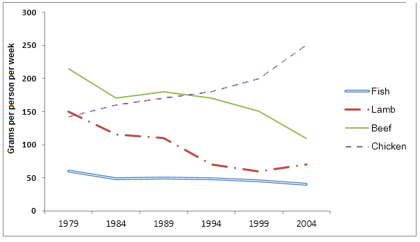
The graph illustrates changes in the amounts of beef, lamb, chicken and fish consumed in a particular European country between 1979 and 2004.
In 1979 beef was by far the most popular of these foods, with about 225 grams consumed per person per week. Lamb and chicken were eaten in similar quantities (around 150 grams), while much less fish was consumed (just over 50 grams).
从大到小写,【点】┭┮﹏┭┮
However, during this 25-year period the consumption of beef and lamb fell dramatically to approximately 100 grams and 55 grams respectively. The consumption of fish also declined, but much less significantly to just below 50 grams, so although it remained the least popular food, consumption levels were the most stable.
趋势相同的放在一起。【点+趋势+程度】
much less significantly(远不那么显著地)这个短语修饰动词 “declined”,说明下降的程度。
to just below 50 grams(到略低于50克)这个短语说明下降后的结果。
The consumption of chicken, on the other hand, showed an upward trend, overtaking that of lamb in 1980 and that of beef in 1989. By 2004 it had soared to almost 250 grams per person per week.
【点+交点+趋势+程度】
指示代词 that
Overall, the graph shows how the consumption of chicken increased dramatically while the popularity of these other foods decreased over the period.
题2
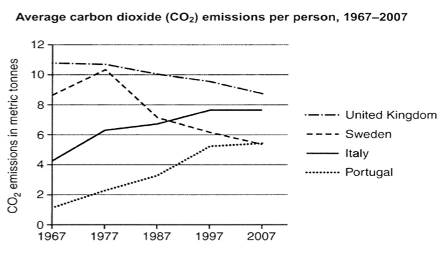
The graph below shows average carbon dioxide (Co2) emissions per person in the United Kingdom, Sweden, Italy, and Portugal between 1967 and 2007.
Summarize the information by selecting and reporting the main features, and make comparisons where relevant.
» Write at least 150 words.
【1-26】The line chart meticulously illustrates the amounts of carbon dioxide produced by each person from 1967 to 2007 in four countries——UK, Sweden, Italy and Portugal.
【2-41】In 1967, the UK led in carbon dioxide emissions per capita at approximately 11 metric tonnes, significantly exceeding Sweden's figure of nearly 9 tonnes. Conversely, Italy and Portugal commenced with substantially lower emissions, at around 4.2 and roughly 1 tonne respectively.
【3-42】In the course of four decades, the level of the UK and Sweden noticeably dropped to approximately 9 metric tonnes and 5.5 metric tonnes respectively. And it is worth mentioning that, in 1977, Sweden peaked at slightly over 10 tonnes per person.
【4-47】The emission of Italy and Portugal, on the other hand, underwent ceiling trends, with Italy surpassing that of Sweden around 1987, at around seven metric tonnes. By 2007, Italy had ranked second with a value of nearly 8 metric tonnes and Portugal's emissions were similar to Sweden's.
【5-26】In conclusion, the picture depicts how the emissions per person in the UK and Sweden deteriorated while the figures in other countries upsurged over the period.
DS
【1-38】The line graph illustrates per capita carbon dioxide emissions in four European countries from 1967 to 2007. Overall, while the UK and Sweden demonstrated downward trends over the period, the opposite pattern was observed in Italy and Portugal.
【2-34】In 1967, the UK had the highest emissions at 11 metric tonnes per person, significantly exceeding Sweden's 9 tonnes. By contrast, Italy and Portugal recorded considerably lower figures at 4.2 and 1 tonnes respectively.
【3-52】Over the following four decades, emissions in the UK gradually declined to 9 tonnes by 2007. Sweden's trajectory was more volatile, peaking at 10 tonnes in 1977 before decreasing steadily to 5.5 tonnes in the final year. It is noteworthy that Sweden's 1977 peak surpassed the UK's emission level at that time.(此处机器生成,不符合图表事实)
【4-42】Conversely, Italy and Portugal experienced continuous growth. Italy overtook Sweden around 1987 when both countries registered 7 tonnes. By 2007, Italy's emissions had risen to 8 tonnes, becoming the second highest, while Portugal's emissions quintupled to 5.5 tonnes, matching Sweden's final figure.
【5-30】In conclusion, while industrialized nations like the UK and Sweden successfully reduced their carbon footprints over the 40-year period, Mediterranean countries showed marked increases, reflecting shifting economic patterns in Europe.
Para2 原段:
In 1967, people in the United Kingdom produced by far the highest quantity of carbon dioxide, with about 11 metric tonnes, followed by Sweden at just under 9 tonnes. In contrast, Italy and Portugal had lower starting points, with the former in the vicinity of 4.2 metric tonnes and the latter at the lowest with roughly 1 metric tonnes.
Bar Chart
例题1
The charts below give information about USA marriage and divorce rates between 1970 and 2000, and the marital status of adult Americans in two of the years.
Summarise the information by selecting and reporting the main features, and make comparisons where relevant.
» Write at least 150 words.
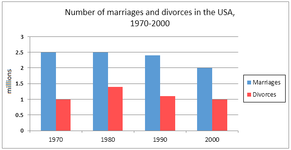

The two charts give information regarding marital statuses in the USA from 1970 to 2000. The first chart shows how the number of marriages and divorces changes between 1970 and2001. The second chart shows the change of the proportion of people in four categories ofmarital status from 1970 to 2001.
Despite remaining constant in the first ten years, at 2.5 million, the number of marriages decreased steadily, falling from 2.5 million in 1980 to 2 million in 2000. However, the number of divorces saw an increase from 1 million to approximately 1.4 million between1970 and 1980 before declining to the 1970 figure by 2000. 【不是in!】
On the other hand, the proportion of married and widowed adult Americans saw a downward trend. To be more specific, the figure for married adults in 1970 was 70 %, which had fallen to slightly below 60% by 2000 while the data for widowed adults went down from about 9% to roughly 5% in the meantime. By contrast, the percentage of those who were never married and divorced went up during the period in question, with the figure for the former growing from about 15% to 20% and that of the latter increasing from approximately 1% to slightly below 10%.
Overall, the number of marriages was considerably larger than that of divorces between 1970 and 2000, and the percentage of married adults was larger than that of all other three marital statuses too at the same time.
总结了始终不变的特征,也可以写变化趋势
The two graphics give information regarding different destinations of graduates and postgraduates of UK in 2008, while excluding data of those choosing a full-time work.
In 2008, further study was by far the most popular of these destinations, with just below 30,000, while the numbers of part-time work and unemployment were similar (around 17000 students). By contrast, much less students decided to dedicate to voluntary work, the firgure for which was only 3500.
However, the corresponding pattern could be seen in second chart. As same as the graduates metioned above, most UK postgraduates gave priority to continuing learning, with around 2757. But a larger proportion of students, nearly 2535, would work part-time job in their future. Meawhile, little people were expected to be unemployed or take on voluntary jobs, the amounts of which was 1625 and 345 respectively.
Overall, it is clear that the number of graduates in the four categories was about 10 times as many as postgraduates while further study was always a prominent choice among graduates and postgraduates.
Pie Chart
静态图 Vs 动态图
例题1
The first chart below shows how energy is used in an average Australian household.The second chart shows the greenhouse gas emissions which result from this energy use.
Summarise the information by selecting and reporting the main features, and make comparisons where relevant.

The two pie charts illustrate how energy is consumed in an average Australian householdand the greenhouse gas emissions that result from these energy uses.
First of all, in terms of the energy consumption of household facilities in Australia, heating possesses the largest proportion of total energy usage in a family unit, accounting for 42%, followed by the figure for water heating which also constitutes a large percentage with 30%. In contrast, the data for refrigeration, lighting, cooling are much less significant, which are 7%, 4% and only 2% respectively. Finally, the remaining 15% of total consumption is used on other appliances.
As for the situation of greenhouse gas emissions from the appliances mentioned above, it largely differs from the first pie. Heating, which consumes the greatest amount of energy, shows a smaller share in greenhouse gas emission, listed in the third place with a proportionof 15%, while the biggest share of emissionsis from water heating (32%). By comparison, proportions of greenhouse gas emissions in refrigeration, lighting and cooling almost double their figures for energy use. Gas derived from other appliances takes up the remaining 28%.
Overall, it is clear that the proportions of greenhouse gas emissions for different purposes basically follow the energy use percentages with a difference in heating, which accounts for half of energy consumption, but produces less greenhouse gas emissions.
练习
The three pie charts demonstrate the fluctuation regarding the total spending of a specific UK school in three year——1981, 1991, and 2001.
During the period of time in the question, despite being volatile, teachers' salaries remained the dominant portion of this school's annual spending, which increased from 40% in 1981 to a half in 1991 and ultimately dipped slightly to 45% in 2001. However, othe workers' salaries experienced a downward trend in the meantime, falling from 28% to 15%.
On the other hand, the costs of "resources" such as books, and "furniture and equipment" initially accounted for the same proportion in 1981, with exactly a quater. However, the former reached a peak of 20% before declining to 23% in the end, while the latter followed the opposite pattern, which hitted the bottom of 5% in 1991 and soared to 23% share by 2001, listed in the second place. As the most stable one, the spending on insurance, starting at 2%, also climbed, but much less significantly to just 8%.
Overall, these two decades witnessed this school's shifting annual spending, with teachers' salaries staying a major but unstable component.
the gap between ... narrow
Table
第一句话交代好数据的具体含义
A is equal/identical to B
The table gives information about consumer spending on different items in five different countries in 2002.
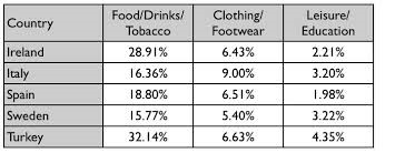
The table gives information regarding consumers spending in 5 countries in 2002.
It is obvious that the amount of money spent on Food/Drinks/Tobacco accounted for the highest proportion in all the countries. Turkey had the largest data (32.14%), closely followed by Ireland (28.91%). Figures of the other three countries varied slightly ranging between 15.77% in Sweden and 18.8% in Spain.
By contrast, the percentage of money paid for Leisure/Education was the lowest of all countries, with Turkey again having the largest data at 4.3%, compared to only 1.9% in Spain. The difference between Italy and Sweden was barely noticeable, constituting 3.2% and 3.22% respectively.
In all the listed countries, the amount of money spent on Clothing/Footwear is slightly higher than that of Leisure/Education while significantly less than that of Food/Drinks/Tobacco. Italian consumers were the largest spenders in this category who used 9% of their money, while Swedish only paid 5.4% of their income. There was little difference between the figures of the other three countries at approximately 6.5%.
Overall, consumers of all the five countries tended to spend their money on daily necessities.